Tips for Choosing Calm Colors to Create a Peaceful Home
Creating a peaceful and relaxing environment at home starts with the colors you choose for your walls, furniture, and accessories. Calm colors can transform any space into a sanctuary where you unwind, recharge, and feel at ease. But with so many color options and styles available, how do you pick the right calm palette for your home? This guide will walk you through key tips and ideas to help you select soothing colors that suit your space and personality.
What Are Calm Colors?
Calm colors are generally soft, muted, and easy on the eyes. They tend to evoke feelings of serenity, balance, and comfort. Common calm colors include:
– Soft blues and greens
– Pale grays
– Warm beige or taupe
– Pastel tones like blush pink or lavender
– Dusty or muted versions of earth tones
These colors naturally help reduce stress and can make a room feel more spacious or cozy depending on how they are used.
Tips for Choosing Calm Colors for Your Home
1. Consider the Room’s Purpose
Start by thinking about how you use each room. Different spaces benefit from different calming tones:
– Bedrooms: Soft blues, lavender, or gentle greens encourage relaxation and restful sleep.
– Living Rooms: Warm neutrals or muted greens create a welcoming, calm environment for conversation and relaxation.
– Bathrooms: Cool tones like pale blue or gray promote a clean, spa-like feel.
– Home Offices: Soft shades of green or blue can boost focus while maintaining calmness.
2. Test Colors in Natural Light
Colors look different depending on the light source. A shade that looks peaceful in a paint store might feel dull or harsh in your home.
– Use sample pots: Paint small sections of your wall.
– Check colors at different times of day: Morning, midday, and evening lighting can alter how colors appear.
– Observe adjacent rooms: Colors flow into adjoining spaces, so consider how the hues will interact.
3. Stick to a Cohesive Palette
Choosing calm colors doesn’t mean you have to paint every room the same shade. Create a cohesive feel by:
– Using variations of the same color family throughout different rooms.
– Picking two or three main colors, then adding softer accent tones.
– Limiting overly bright or contrasting colors which interrupt the calming effect.
4. Use Neutrals as a Base
Neutrals such as beige, taupe, or warm grays provide a soft backdrop that works well with nearly any accent color. This flexibility allows subtle pops of calm colors without overwhelming the senses.
Neutrals also help make smaller spaces feel larger and less cluttered by reducing visual noise.
5. Add Texture and Layering
Calm colors are often understated, so adding texture through fabrics, rugs, and furniture can bring depth and interest.
– Linen or cotton fabrics
– Soft wood finishes
– Matte or satin paint finishes
– Plants and natural materials
These details keep spaces from feeling flat while maintaining the overall serene tone.
6. Consider Color Psychology
Different colors evoke different emotional responses. For a calming home, consider:
– Blue: Represents peace and stability, lowers blood pressure.
– Green: Symbolizes nature and balance; reduces anxiety.
– Lavender: Soft and tranquil; promotes relaxation.
– Gray: Neutral and soothing; good for creating minimalistic calm.
– Beige and warm neutrals: Inviting and grounding.
7. Avoid Overly Bright or Dark Colors
Very bright or intense colors like neon yellow or bright red can create visual tension and energy rather than calm. Similarly, very dark colors can make small spaces feel cramped and heavy unless balanced with lighter accents.
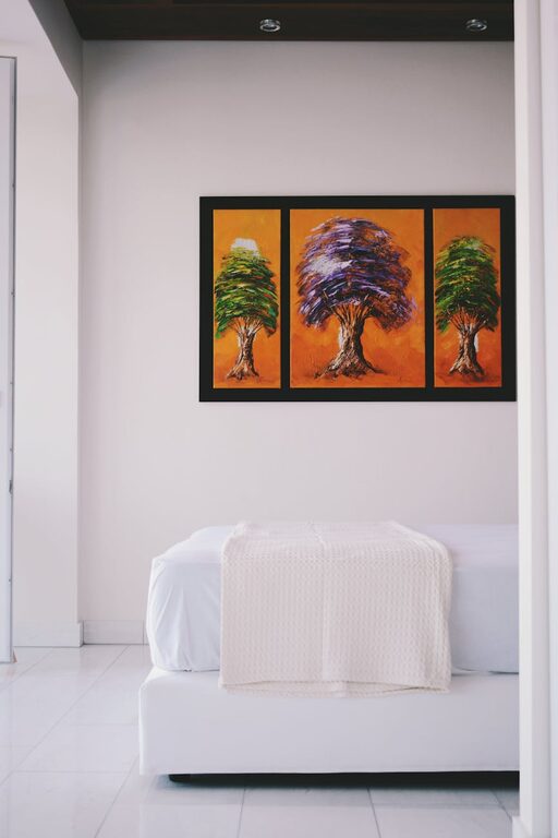
8. Personalize with Accents
Once you’ve selected your calm base colors, personalize your space with small bursts of color that bring joy without overwhelming the calm atmosphere.
– Soft cushions or throws
– Artwork with gentle tones
– Subtle patterned wallpapers or fabrics
These accents can be easily swapped out to refresh your space over time.
Popular Calm Color Combinations
Here are a few tried-and-true pairings to inspire your home:
| Primary Color | Complementary Colors |
|—————|———————|
| Soft Blue | Pale gray, white, warm beige |
| Sage Green | Cream, soft brown, muted pink |
| Light Gray | Dusty rose, charcoal, soft teal|
| Warm Beige | Olive green, soft white, terracotta|
Experiment with these combinations using samples before committing.
Final Thoughts
Choosing calm colors for your home is a wonderful way to create a peaceful retreat that supports your well-being. By focusing on the purpose of each room, testing colors in natural light, and layering textures, you can craft a serene and stylish space that feels balanced and welcoming. Remember, the best calm colors are the ones that make you feel peaceful and comfortable in your own home.
Happy decorating!